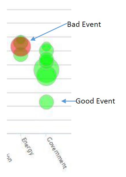
This is a graphical way to explore the scenario of events leading to a particular endstate. Choose the endstate using the pull down menu at the top.
Each bubble represents an event that has a non-zero influence rating for this endstate. Bigger bubbles have greater influence on the development of the endstate. Green are positive (i.e., should be encouraged) and red are negative (i.e., should be prevented or avoided). Bubbles float up as they become more likely.
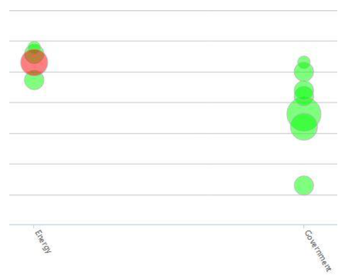
Events are arrayed left to right by their category (shown here are energy and government). You can zoom in to help separate bubbles that overlap. Zoom by dragging a rectangle around the bubbles you want to see. Below are the same events blown up to better separate them.
There is a refresh button in the upper right corner.
If you click on a bubble you go to the page for that event and you can see and enter evidence for or against it. You can also read more detail about what the event is about.
If it was your job to make this endstate happen, you would focus on two situations:
- Larger green bubbles that are not very likely today (at the bottom) and need effort to improve their chances of happening
- Larger red bubbles that are likely today (near the top) and could represent serious obstacles